Data Analyzers
Arkalos provides a flexible API for analyzing structured datasets. Its analyzers help uncover patterns, segment data, and visualize important trends using powerful visualizations built with Altair and Vega specifications.
Currently available analyzers:
ClusterAnalyzer– for clustering, pattern recognition, and feature importance insights
ClusterAnalyzer
Clustering is an unsupervised learning method used to group similar data points together based on their characteristics. It’s useful in many fields such as marketing segmentation, customer behavior analysis, anomaly detection, and recommendation systems.
In Arkalos, ClusterAnalyzer simplifies the process of clustering and visualizing your data.
Example: Segmenting a Marketing Campaign Dataset
Let’s walk through a step-by-step analysis of customer behavior using a marketing campaign dataset.
📥 Step 1: Load the Dataset
Download the marketing_campaign.csv dataset from Kaggle and save it under data/drive or your notebook's working directory.
import polars as pl
from arkalos import drive_path
from arkalos.data.analyzers import ClusterAnalyzer
from arkalos.data.transformers import DataTransformer

df = pl.read_csv(drive_path('marketing_campaign.csv'), separator='\t')
🧹 Step 2: Preprocess and Clean the Data
Before clustering, clean and prepare the dataset using DataTransformer.
dtf = (DataTransformer(df)
    .renameColsSnakeCase()
    .dropRowsByID(9432)
    .dropCols(['id', 'dt_customer'])
    .dropRowsDuplicate()
    .dropRowsNullsAndNaNs()
    .dropColsSameValueNoVariance()
    .splitColsOneHotEncode(['education', 'marital_status'])
)

cln_df = dtf.get()  # Get cleaned Polars DataFrame

print(f'Dataset shape: {cln_df.shape}')
cln_df.head()
📊 Step 3: Correlation Heatmap with Altair
Visualize relationships between numerical features using a correlation heatmap.

This heatmap helps identify redundant or highly correlated features to consider removing or combining before clustering.
🌿 Step 4: Hierarchical Clustering and Dendrogram
To estimate the optimal number of clusters, start with Agglomerative Hierarchical Clustering and plot the dendrogram.
n_clusters = ca.findNClustersViaDendrogram()
print(f'Optimal clusters (dendrogram): {n_clusters}')

ca.createDendrogram()

The dendrogram shows how clusters are merged and suggests an optimal cluster count where vertical lines (distance) are largest.
📈 Step 5: Elbow Plot (K-Means Diagnostic)
Another common technique to estimate the number of clusters is the elbow method, which plots total within-cluster variance.
n_clusters = ca.findNClustersViaElbow()
print(f'Optimal clusters (elbow): {n_clusters}')

ca.createElbowPlot()

The “elbow” point marks the optimal cluster count where adding more clusters yields diminishing returns.
🧬 Step 6: Perform Hierarchical Clustering
Use the selected number of clusters to perform bottom-up agglomerative clustering:
📊 Step 7: Cluster Bar Chart Grid (Feature Importance)
After clustering, visualize which features differentiate each cluster using an interactive bar chart grid, sorted by Gini importance:

Each subplot corresponds to a feature; bars represent average values per cluster.
📋 Step 8: Summary Report
Print a human-readable summary showing the most informative features for each cluster.
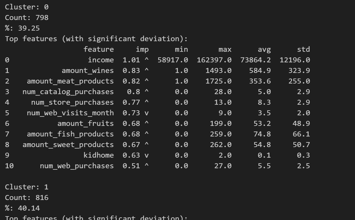
Each cluster's profile includes min, max, average, and standard deviation for each feature.
K-Means Clustering
Compare hierarchical clustering with K-Means, a partition-based method often faster for large datasets.
ca_kmeans = ClusterAnalyzer(cln_df)
ca_kmeans.clusterKMeans(3)
ca_kmeans.createClusterBarChart()
Notice how different clustering methods may yield different insights depending on the dataset's structure.